From the start of the 2016-17 season, the Premier League will have a shiny, bright new logo to show off and will no longer have a sponsors name attached to it, not that anyone outside of football’s corporate bubble was ever calling it the “Barclay’s Premier League.”
The new logo gets rid of the lion with his paw on a football – he wasn’t fooling anyone, we all know lions can’t trap a football with such a regal confidence. As way of punishment for the lion getting ideas above his station and thinking he could mix it with the best talents in the league, his severed head now serves as the focal point of the new logo.
“We are very pleased with the outcome,” honked Premier League suit Richard Masters, “a visual identity which is relevant, modern and flexible that will help us celebrate everyone that makes the Premier League.
“We look forward to sharing more details of our new positioning in the coming months.”
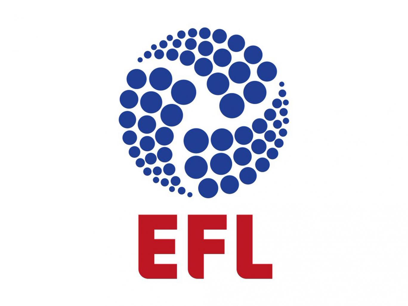
Any new logo that drops the corporate association can’t be a bad thing, and the redesign could have been a whole lot worse. Just look at the new logo for the Football League, which resembles a new washing detergent… or is it a nuclear energy company?
As for the Premier League, the logo design has actually changed a number of times over the years. By definition, the Premier League is a private company wholly owned by its 20 Member Clubs who make up the League at any one time. Therefore, like with any business, it is important that their branding is effective and this all starts with a good logo. This is the first time there has been a big change in the design of the logo though, as it has now been simplified, with an injection of colour and the removal of any sponsorship.
If your business is in need of a new logo, you could use a logo maker to design your own. You’d almost definitely do a better job than those who created the Football League logo…
